How I Create a Greeting Card Collection: From Sketch to Final Artwork
- Jun 16
- 5 min read
Updated: Jul 17

Have you ever wondered how a greeting card goes from a simple idea to a finished design ready for printing?
As a freelance illustrator, I create artwork for greeting cards and other products. While every project is a little different, my greeting card designs usually follow a structured creative process that helps me develop cohesive collections with a strong visual identity.
Today, I'm taking you behind the scenes and sharing how I create a greeting card collection - from the first idea to the final artwork.
1. Choosing the Occasion
Every collection starts with deciding on a category.
This could be a seasonal occasion such as Christmas, Halloween, or Father's Day, or an evergreen category like Birthday, Thank You, or Congratulations.
The occasion provides the framework for the collection and helps guide all creative decisions that follow.

2. Developing a Theme
Once I've chosen the category, I start thinking about a theme.
For example, a birthday collection might revolve around a circus theme, while a Father's Day collection could feature rock 'n' roll-inspired illustrations.
Having a clear theme helps create a cohesive collection while still allowing room for individual card concepts.
A strong theme also makes it easier for retailers and licensing partners to see how the designs work together as a collection.
3. Research and Inspiration
Before I start drawing, I spend time researching the market.
I look at greeting card shops, browse online retailers, and explore Pinterest to understand current trends and identify what types of designs are selling within a specific category.
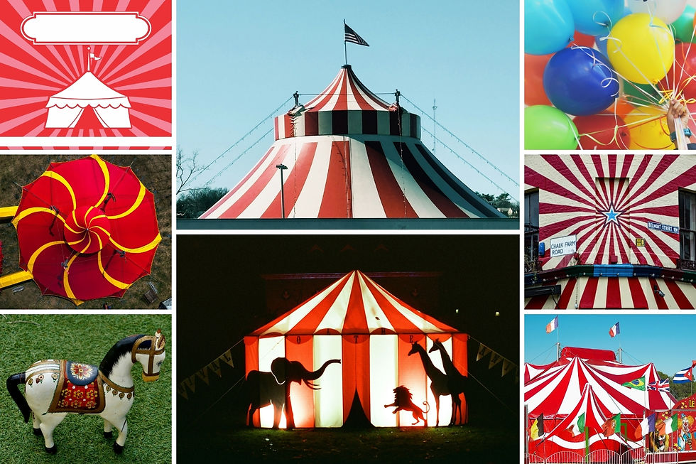
I collect my findings on a Miro board, where I can compare different styles, color palettes, captions, and illustration approaches.
The goal isn't to copy existing work - it's to understand the market and discover opportunities for creating something fresh and appealing.
4. Creating Thumbnail Sketches
Once I have enough inspiration, it's time to start sketching.
I begin with small thumbnail sketches using pen and paper. These quick drawings help me explore different ideas and compositions without spending too much time on details.

One thing I always keep in mind is card display visibility. Since greeting cards are often sold in racks where only the top portion of the card is visible, I make sure the caption is positioned within the upper third of the design whenever possible.
This helps the card communicate its message immediately when displayed in stores.
5. Refining the Sketches Digitally
After selecting the strongest concepts, I scan my thumbnail sketches and import them into Adobe Fresco on my iPad.

At this stage, I create more detailed sketches and refine the composition, typography placement, and illustration elements.
This step allows me to solve design problems before moving on to color and final artwork.
6. Building a Color Palette
Color plays a huge role in creating a successful greeting card collection.
I usually create a dedicated color palette for each collection. To help with this process, I often use the Color Palette PRO Generator from Color Palette Studio, which generates palettes based on specific themes and helps ensure there are enough high-contrast color combinations.

When selecting colors, I also consider current color trends as well as traditional colors associated with particular occasions. For example:
Red and green for Christmas
Orange and purple for Halloween
Soft pastels for Easter
Once I have my final palette, I save it as a library in Adobe Creative Cloud so I can access the same colors across Adobe Fresco and Photoshop.
7. Creating Color Drafts
Before creating the final artwork, I make quick color drafts.
These rough color studies allow me to test color distribution, identify potential issues, and evaluate how the overall design feels before investing time in detailed rendering. This stage often saves a significant amount of time later because many color decisions have already been made.

Sometimes I still make adjustments during the final illustration phase, but the color drafts provide a strong foundation.
8. Illustrating the Final Artwork
With the sketches and color plan approved, I begin creating the final illustration in Adobe Fresco.

I typically work element by element, gradually building up the full design.
Once the artwork is complete, I review the colors, contrast, and overall visual balance. One of my favorite quality-control checks is temporarily converting the design to black and white.
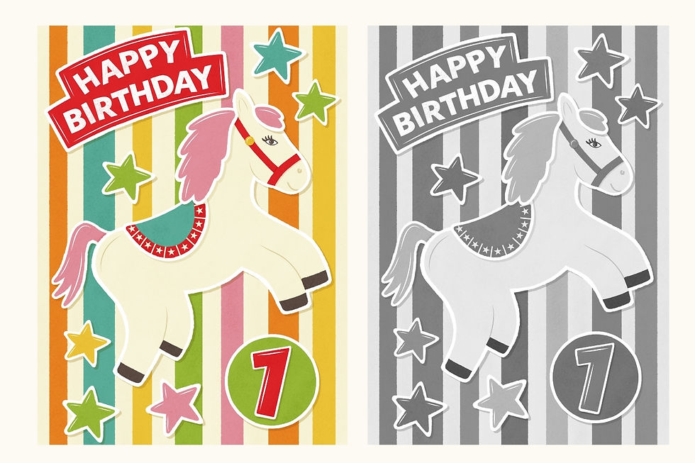
This allows me to quickly see whether there is enough contrast throughout the design and whether the caption remains easy to read. Good readability is especially important for greeting cards because the message needs to be instantly recognizable.
9. Creating Coordinating Patterns
Many of my greeting card collections don't stop at the card front.
Once the main illustrations are complete, I often create coordinating patterns that complement the collection. These patterns can be used in a variety of ways, including envelope liners, the backs of greeting cards, packaging, tissue paper, gift wrap, or other matching products.
To create these designs, I select key motifs from the illustrated cards and transform them into repeating patterns. Depending on the project, I create about 2-4 patterns with varying levels of complexity and color value.
Because the patterns are built from artwork already used in the collection, they help strengthen the overall visual identity and make the collection feel more cohesive.

10. Reviewing the Collection
Before considering a collection finished, I review all designs together.
Looking at the cards as a group helps ensure they feel cohesive and consistent while still offering enough variety.
I also like to leave the artwork for a day before doing a final review. Returning with fresh eyes often reveals small improvements that weren't obvious during the illustration process.
This final review stage is one of the simplest ways to improve the quality of a collection.
11. Exporting the Final Files
Once I'm happy with every design, I export the final high-resolution artwork files.
These files are then ready for submission to licensing agents, greeting card publishers, manufacturers, or printing partners.
At this stage, hours of research, sketching, color exploration, and illustration come together as a finished greeting card collection.

Final Thoughts
Creating a greeting card collection is much more than drawing a single design. It involves research, concept development, color planning, illustration, and careful refinement.
I enjoy every part of the process - from the first rough sketch to seeing a finished collection come together. However my favourite part is of course drawing the final design.
It's always exciting to watch a simple idea evolve into artwork that helps people celebrate life's special moments.
If you have any comments or a question, please feel free to leave it below and I'll get back to you!

Hi, I'm Franzi!
I am a freelance illustrator, who wants to bring a spark of joy to everyday life. My design style focuses on happy colors, a playful minimalistic aesthetic and a hand-drawn feel through layered textures.
I create unique illustrations for greeting cards as well as seamless patterns for fabric, wallpaper and home decor items.
Interested in a collaboration, licensing my artwork for your products, or looking for a custom illustration tailored to your project? Just send me a message and I will get in contact with you.


.png)


Comments